
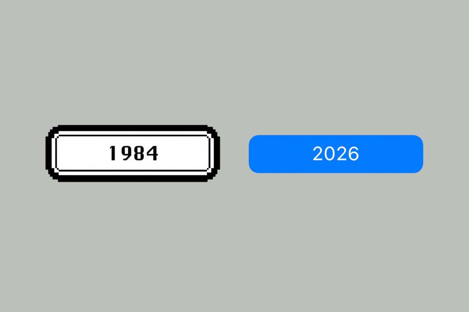
Macworld The Mac operating system has been around for over 42 years, and it’s seen a lot of changes. There’s one aspect of the user interface that has changed a lot: the buttons that appear on screen. Button changes usually accompany major graphical overhauls, so they’re easy to overlook. Now there’s a website that has collected them all in a neat interactive gallery. At mac-buttons-timeline.vercel.app, the different button styles can be viewed by scrolling along a Time Machine-esque timeline. Turns out that over 42 years, there have been 11 different style changes. By looking at the different designs, you can see that Apple has gone back and forth between more elaborate designs to very simple ones. You have the bold original button from 1984, which transitioned to a very simple button in 1986. That button stuck around for 11 years until Apple gave it a shade of gray in 1997. Then there were the glossy, gradient days of Mac OS X Aqua in the early an
UPVOTERS
Community appreciation
See who found this content valuable and showed their support.
No upvotes yet.
Be the first to show your appreciation for this content.
TOPICS
Explore the same topics
Discover more content from the topics this post is mapped to.
Keep browsing
Explore more from this topic
Dive into the full feed of curated posts covering this category.
Discussion
Say something first
It all starts with you—share your thoughts now.